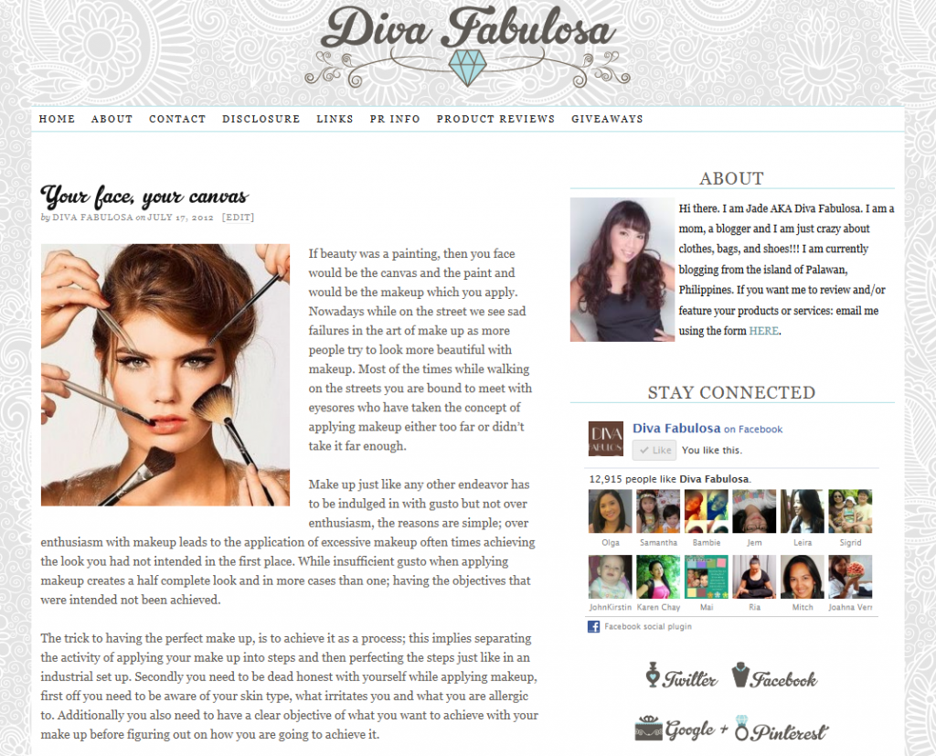
If you haven’t noticed yet, my online home has gotten a renovation. My new sleeker and more fab look is courtesy of Kaye at Squeesome. She also gave me a new time line cover and a spanking new watermark for my photos. I’m definitely happy with my makeover!
The design and layout is cleaner and easier to the eyes. The black and white theme has a minimalist appeal that pleasantly contrasts with the bold and glitzy design of the badges and navigation buttons on the side bar. Everything looks perfectly put together just as an entire outfit should look. This diva is feeling fabulous about this website’s new look.
Kaye’s Squeesome is heaven-sent to bloggers and website owners with the need to renovate their pages. They have service packages that can provide a variety of options for those with web design needs. You can actually avail of their pre-made designs to save some money. Even if these designs are pre-made, there really is no need to worry about another site having the same design as yours. They only sell their pre-made design to one customer. The reason why it’s cheaper because it the design is as is. You can avail of additional add ons though if you want to. You can choose from any of these regular packages depending on the scope of design services you need.
Kaye will be happy to help you figure out what service package will best suit your needs. Get in touch with her and find out how much and how long it will take to complete your website design project. Avail of 10% discount when you use the code DIVA, valid till June 30, 2013.
Oh, and here’s my old blog design. Do you agree that it was just right for me to have gone out with the old and in with the new? 🙂


